Lawyers Weekly, in partnership with Zaliet, is pleased to announce the winners for the Legal Website Awards 2017
Partnered by

With more clients online than ever before, it has become absolutely essential for law firms to present an appealing digital shopfront. Some might even say that having a good, user-friendly website could be the difference between attracting more clients and turning them off.
According to Zaliet, 75 per cent of consumers research a product or service online before investing money in the said product or service. The statistic alone proves that it’s become paramount for firms to make sure their websites are ticking all the boxes in order to add to their bottom line.
To uncover who is successfully enticing clients through the screen, Lawyers Weekly, in partnership with Zaliet, is pleased to present the Lawyers Weekly Legal Website Awards 2017.
For the first time, we decided to call on our readers to nominate the firm they believe is moving with the digital age and consistently redeveloping their website to appeal to users. The awards asked readers to share which firm should take out five core categories: the Design Award, User Experience Award, Use of Technology Award, Content/Copywriting Award and Photography Award.
We then whittled down the nominations to 10 finalists per category, opening up a voting portal for readers to have their say on which firm they believe is leading the pack across the key metrics. On behalf of Lawyers Weekly and Zaliet, we would like to congratulate all of the winners.
Design Award
Winner: Arnold Bloch Leibler
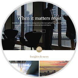
AS THE winner of this category, Arnold Bloch Leibler has been recognised as the firm whose website successfully conveys its overall objective through its visual design. For this category, those who voted needed to take into account each finalist’s use of images, branding, text/ font and colours.
Looking at the firm’s website, it’s easy to see why it was voted number one in this category. The designer’s use of images as a backdrop behind each major breakout box makes them easy to identify as being separate parts of what Arnold Bloch Leibler offers collectively. Arnold Bloch Leibler’s branding is strong in the sense that it doesn’t completely overpower the page but resonates enough to remind users which firm’s website they’re viewing.
Its full name is located on both the header and footer of each page, while its abbreviated logo – ABL – is spread evenly throughout in a smaller format to keep the branding noticeable but not completely in the viewer’s face.
The firm’s use of text/font is also worth commending in its overall design. A simple yet effective approach has been taken to ensure that the text is readable, avoiding any mixed messaging.
Key headlines that clients would be searching for are made prominent in a bigger font size, while interesting but not as essential information is presented in a smaller font size, making for a clear user experience.
The colours that Arnold Bloch Leibler has chosen for its overall design give the impression of a classy firm. The black, white and gray colouring makes it easy on the eyes, with the flecks of gold adding a sophisticated touch.
Arnold Bloch Leibler’s website has been a longstanding priority throughout its 60-plus years of operation. During this time, it has been consistently sharpened in an effort to move with the times and appeal to more clientele in key practice areas, such as banking and finance, intellectual property and taxation law, among many others.
The website itself says it best: “While our storied history is long, we are a modern firm. We see the law as an instrument of change, as a way forward.”
Photography Award
Winner: Sainty Law

WE ALL know the old saying, ‘A picture is worth a thousand words’. As such, a big focus for any firm should be the photography they display on their website.
The Photography Award asked voters to judge each finalist’s homepage images, professional portraits, location photos and even the photography accompanied in different areas of law.
Sainty Law has carved up in this category, demonstrating expertise in all of these points. The Sydney boutique law firm has been recognised as one that takes into account what the photography on its website says to current and prospective clients.
The homepage images are unique, with an eye-catching slideshow available to view which features large-scale images that move, as well as still landscape images of the harbour city and principal Katherine Sainty.
The motion photography paints the picture of Sainty Law being a progressive firm, while the imaging which pays tribute firm’s location and its founder offers a nice personal touch.
The portraits of each team member should also be commended in this respect. Clearly professionally shot, they provide an inviting and friendly feel, with each team member smiling boldly. This, of course, then leads the client or prospective client to believe they’re in safe hands, with the imaging conveying that all members of staff are professional and approachable.
Collectively, images on the homepage and throughout the entire website take into account Sainty Law’s bold orange colour, which is strategically featured throughout the entire website to keep the brand consistent. For example, images are adjusted to increase warmth and emphasise orange tones.
In addition, each of the areas Sainty Law has expertise in has its own image, making each service on offer stand out. For example, the media and entertainment area of expertise popout box has an image of a camera lens accented by warm lights in the background.
This approach is also taken with each blog posted, with the photography demonstrating what the subject matter is about.
The consideration that has been put into not just Sainty Law’s homepage, but its entire site, makes it a worthy recipient of the Photography Award. The consistent style it takes is easy on the eyes and will be appealing to clients seeking its service.
User Experience Award
Winner: McCabes Lawyers
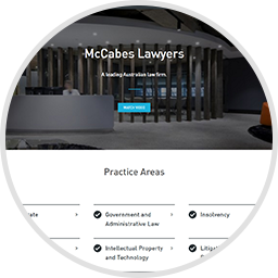
AS THE recipient of this award, McCabes Lawyers is recognised as the firm whose website is the best to navigate around.
The ease of which a user can operate a firm’s website is of utmost importance. After all, one glitch in the system can have the potential to turn a client away, consequently impacting the firm’s bottom line.
McCabes Lawyers has taken this into account, making sure that each part of its website is userfriendly, while avoiding any malfunctions in the system.
What it also offers though is a pleasing experience to the user. The firm’s layout sees each of its 10 practice areas available in a clear, dot point format on the homepage, meaning that straight away clients know what McCabes Lawyers offers and how it can best assist in any legal enquiry.
With just one click, the user is taken beyond the homepage with extensive information presented about each specific practice area. For example, a user clicks on the ‘Corporate’ dot point underneath the ‘Practice Areas’ headline and is transported to both an overview of what the corporate team at McCabes Lawyers offers, and what areas of expertise they specialise in. The user can then elect to click on the specific areas PHOTOGRAPHY AWARD CONTENT/COPYWRITING AWARD USE OF TECHNOLOGY AWARD USER EXPERIENCE AWARD Winner: Sainty Law Winner: Justitia Winner: Her Lawyer Winner: McCabes Lawyers of expertise – such as mergers and acquisitions, private equity, capital raising, corporate law, and commercial – where then a description tailored specifically to that area of expertise is available for users to view.
This makes it incredibly user-friendly, especially for clients who may be confused about the many different types of legal expertise on offer.
In addition to the ease in navigating the firm’s practice areas, McCabes Lawyers also offers a good user experience for those looking beyond just legal advice for a particular problem. It has podcasts, quizzes and opinion pieces that clients can browse through if they want to, which are clearly laid out on the firm’s homepage.
On top of this, the website is mobile-friendly, which in this day and age, with more people opting to use their handheld device rather than their desktop, is a necessity.
Lastly, no firm’s website is complete without a field dedicated to a contact users can turn to if they have a question. To contact McCabes Lawyers, users have options to do so via an electronic template or a direct phone call to its offices in Sydney and Newcastle.
The consistency of ease that plagues throughout the McCabes Lawyers website makes it a worthy recipient of the User Experience Award.
Content / Copywriting Award
Winner: Justitia
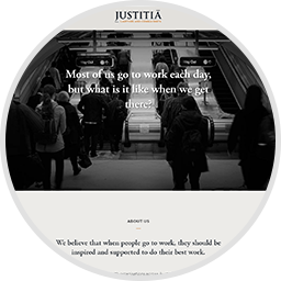
FOR THIS category, voters were asked to judge finalists on a number of key areas which make up the content and copy of each website. This included, but was not limited to, whether the finalist had customised content for different practice areas, blogs on new or current legislation and how that affects clients, and case studies from clients on how the firm has helped them.
As the winner of this award, Justitia has been recognised as the firm that is going above and beyond to provide users with substantial content on their website.
Gone are the days where firms can get by in providing dry content. What makes Justitia stand out in this category is that it takes into account what will attract clients’ attention.
As an employment, discrimination and labour relations law firm, Justitia has provided clear content to its clients – the vast majority of whom are employers – in a way that demonstrates they understand where their priorities lie.
As an example, the firm’s homepage asks the question: ‘Most of us go to work each day, but what is it like when we get there?’ Immediately, the user is drawn in to this unique approach to grab attention.
It is then followed up with an ‘About us’ section which states: “We believe that when people go to work, they should be inspired and supported to do their best work”.
“Justitia is an award-winning workplace law firm focused on delivering positive outcomes informed by good business sense,” the website notes.
“Our lawyers understand that exceptional workplaces need more than just legal solutions.
“That’s why we work together with professionals from a range of disciplines to give our clients the very best workplace advice.”
In addition to this copy, Justitia provides blogs to its clients, which are all written in a consistent but interesting and accessible style. They cover everything from workplace investigations and workplace bullying to underpayments, discrimination and biased thinking.
Again, this approach takes into account its core clientele – employers – with blogs tailored to questions and concerns these clients might be facing.
Furthermore, the authors of the blogs use keywords and focus on SEO to ensure that the firm is the number one Google search under the name ‘Justitia’.
Lastly, Justitia allows users to sign up to updates, ensuring that clients receive regular content to their inbox on what’s making headlines at the firm.
Use of Technology Award
Winner: Her Lawyer
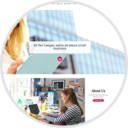
A WEBSITE would be dull without some exciting high-tech features. As such, firms need to be sure that they’re keeping up with the rapid development of technology and bolster their website with new capabilities.
As the winner of this category, Her Lawyer has been recognised as the firm which has effectively done this, making a conscious effort to keep up with the digital age, while offering an edge over competitors.
In its approach to designing its website, Her Lawyer has used LawConnect, which is described as a secure cloud-based document management system for clients.
This enables clients to access their legal documents and communicate with their lawyers under one platform.
As quoted on Her Lawyer’s website “LawConnect enables us to share documents with you without exposing them to the risks of email, keeping them safe at all times and making them really easy for you to find whenever you want to view them”.
“You are also able to upload your own documents (e.g. a copy of your Drivers Licence or Passport perhaps) into LawConnect for sharing with us or safe-keeping,” the Her Lawyer website says.
“Our firm provides LawConnect for you at no charge and you can access LawConnect from anywhere in the world with an Internet connection.”
In addition to this platform, Her Lawyer accepts online appointments in the tap of a button through its ‘Book Online’ pop-out box, powered by LawTap.
With just one click, users are invited to a new page that describes all of the lawyers at Her Legal in a short bio which includes their area of expertise, location, languages spoken and admission date.
The LawTap platform then allows users to see which dates and times each of the Her Legal staff have appointments open, enabling them to select either a free phone consultation, one-hour telephone consult or a one-hour Skype call.
Also powered by LawTap, Her Legal has a series of online legal forums open to users, where they can go to “better understand the law”.
And if that’s not enough, the Her Legal website also has built-in capabilities for users to start a live chat with the tap of their mouse, enabling them to contact a representative at the firm instantly.
All of these technological offerings present a huge time-saver to clients, and position Her Legal as a modern law firm which is taking advantage of digital disruption to the best of its ability.

Emma Musgrave
Emma Musgrave (née Ryan) is the managing editor, professional services at Momentum Media.
Emma has worked for Momentum Media since 2015, including five years spent as the editor of the company's legal brand - Lawyers Weekly. Throughout her time at Momentum, she has been responsible for breaking some of the biggest stories in corporate Australia. In addition, she has produced exclusive multimedia and event content related to the company's respective brands and audiences.
Prior to joining Momentum Media, Emma worked in breakfast radio, delivering news to the Central West region of NSW, before taking on a radio journalist role at Southern Cross Austereo, based in Townsville, North Queensland.
She holds a Bachelor of Communications (Journalism) degree from Charles Sturt University.
Email Emma on:

